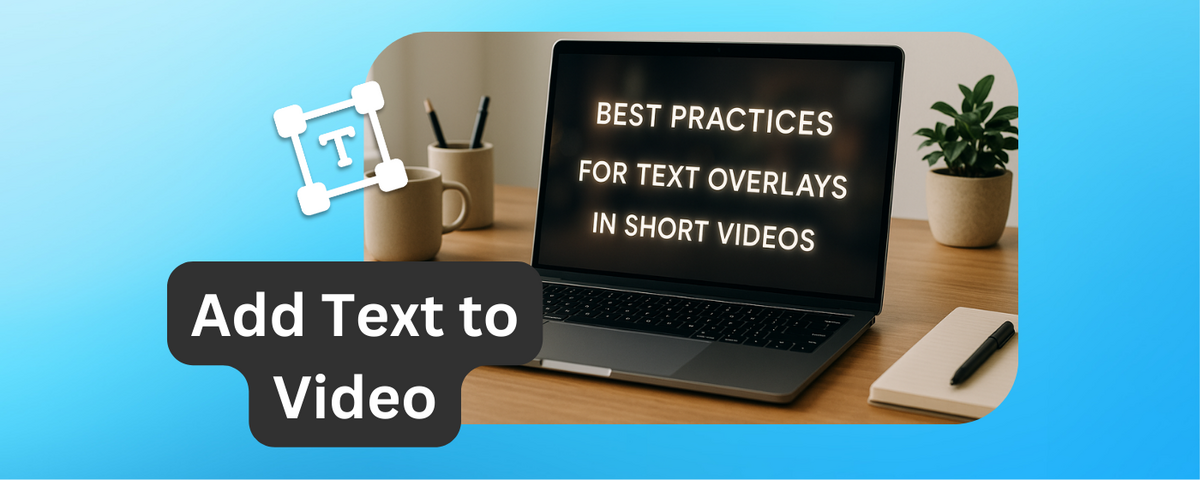
Text overlays make short videos more effective by ensuring your message is clear, even without sound.
With most viewers scrolling on mute, overlays grab attention, improve understanding, and make content accessible to a broader audience. Here’s what you need to know:
- Keep text readable: Use sans-serif fonts (e.g., Arial, Helvetica), high contrast, and proper font sizes for mobile screens.
- Placement matters: Position text in safe zones to avoid cropping by platform interfaces (e.g., TikTok, Instagram Reels).
- Short and clear: Use concise phrases and display text long enough for easy reading.
- Accessibility counts: Use plain language, descriptive captions, and high-contrast designs for inclusivity.
- Stay on-brand: Use consistent fonts, colors, and styles that reflect your brand identity.
Tools like DriveEditor simplify the process with features like presets for consistent branding, adding text to video and other quick video edits.
Tips for Adding Text to Your Videos
Readability and Clarity Checklist
Clear and easy-to-read text keeps viewers engaged, while poor readability can quickly drive them away.
Choose Clear Fonts
Stick with sans-serif fonts for better readability, especially on mobile devices. Reliable options include Arial, Helvetica, Roboto, Montserrat, Open Sans, and Lato. For a more modern look, you might try Poppins, Quicksand, or Raleway.
Avoid decorative or script fonts - they might look great in static designs but often lose their clarity when displayed briefly over moving video. The goal is to use fonts that stay legible, even when viewers only have a few seconds to absorb your message.
Use High Contrast
High contrast between text and background is key to making your message stand out, even under varying lighting conditions. If your video includes scenes with different brightness levels, a semi-transparent overlay behind the text can ensure it remains readable. It's a good idea to test your design on multiple devices to confirm the text is clear in every situation.
Keep Text Short
Short, focused text is easier to understand quickly. If your message is longer, break it into several short overlays, each delivering one clear thought. This approach helps maintain clarity and ensures your audience can process the information without feeling overwhelmed.
Use the Right Font Size
Choose a font size that works across all devices, especially smaller screens. Always test your text on mobile devices to ensure it’s easy to read.
Set Proper Display Duration
Make sure the text stays on screen long enough for viewers to read it comfortably. Balance the display time with the pace of your video so the message is clear without interrupting the flow of visuals.
Placement for Maximum Impact
 Where you place your text can make or break its effectiveness, especially on social media. Thoughtful positioning ensures your message stays clear and visible, no matter the platform.
Position Text in Safe Areas
To avoid text being cropped or hidden by platform interfaces, stick to the "safe zones." Each platform has specific dimensions to help keep your message front and center.
- Instagram Stories: Use a 1,080 x 1,920 pixel frame, but leave a 250-pixel buffer at the top and bottom. Keep key text at least 65 pixels away from the edges, focusing it within the central 1,080 x 1,420 pixel area.
- Instagram Reels: With the same 1,080 x 1,920 format, maintain buffers of 108 pixels at the top, 320 pixels at the bottom, 60 pixels on the left, and 120 pixels on the right.
- TikTok: Position important text in the upper third of the screen. Avoid placing text in the top and bottom 10% of the screen, as these areas are often obscured by notches or interface elements.
By following these safe zone guidelines, you can ensure your text remains readable and impactful across different platforms.
Many video editing tools, like DriveEditor - Google Drive video editor Chrome extension, offer built-in safe zone overlays. These visual guides can help you keep your text in the right areas, ensuring your message looks great on any device.
Accessibility and Text Overlays
Accessibility goes hand-in-hand with readability, ensuring your text overlays resonate with every viewer. Crafting overlays with accessibility in mind isn't just thoughtful - it's essential for connecting with a diverse audience. This approach ensures your content reaches viewers with disabilities, non-native speakers, and even those watching in less-than-ideal conditions.
Use Plain and Simple Language
Text overlays should be straightforward and inclusive, avoiding overly technical language or insider jargon. Using plain language makes your content accessible to a wider audience, including individuals with cognitive disabilities, non-native speakers, and those relying on screen readers. It also helps viewers quickly grasp your message, especially when watching without sound.
Avoid acronyms and technical terms unless absolutely necessary. When you do use them, spell them out first and provide clear explanations. Keep sentences short, use active voice, and aim for a 6th to 8th-grade reading level. Tools like the Hemingway app can help you check readability.
For example, compare these two descriptions of COVID-19:
- World Health Organization: "Coronavirus disease (COVID-19) is an infectious disease caused by the SARS-CoV-2 virus." (9th-grade reading level)
- Green Mountain Self-Advocates: "It is a new illness spreading around the world. Its nickname is coronavirus." (1st-grade reading level).
The simpler version is far more accessible, demonstrating how plain language can make a big difference.
Provide Descriptive Captions
Captions are more than just subtitles - they're a tool for enhancing accessibility. They’re essential for viewers who are deaf or hard of hearing, as well as for anyone watching in noisy environments or preferring to read rather than listen.
Good captions don’t just transcribe speech; they add context. Edit out filler words like "uh" or "um" for smoother reading and include sound effects, music cues, and speaker identifiers when needed. For instance, phrases like "upbeat music plays" or "phone buzzes" provide valuable audio context.
Timing is everything. Captions should sync with the audio, allowing viewers to read comfortably without feeling rushed. Break longer sentences into smaller chunks and place them at natural pauses in the dialogue for better readability.
Make Text Visually Accessible
Contrast matters. High-contrast text ensures readability, especially for viewers with visual impairments or those watching on small screens in bright environments. Always test your text overlays to confirm they stand out against the background.
Legibility on all screen sizes is another key factor. From smartphones to large monitors, your text should remain clear and easy to read, no matter the device.
Be mindful of color blindness when designing overlays. Avoid relying solely on color to convey meaning. For example, if red text is used to indicate urgency, include words like "urgent" or "important" to reinforce the message.
Tools like Google Drive Video Editor can help fine-tune text overlays. Use its preview features to test brightness, contrast, and overall clarity under different conditions, ensuring your message is accessible to everyone, everywhere.
sbb-itb-0482353
Branding and Consistency
Text overlays are more than just functional - they're an extension of your brand. Think of every font, color, and design choice as a chance to reinforce your identity. When your videos consistently reflect your brand, they become instantly recognizable, building trust and familiarity with your audience - even before your logo appears.
Use Your Brand's Fonts and Colors
Stick to your brand's established fonts and colors to maintain a uniform look across all your content. For example, if your brand relies on a specific shade of blue (#2E86AB) and orange (#F24236), ensure these exact colors are used in your text overlays. Precise hex codes or RGB values are essential for consistency.
To streamline this process, create a style guide. It should outline approved fonts, their weights (like regular, bold, or light), color combinations, and any effects like drop shadows or outlines. This guide is especially helpful for teams or freelancers who collaborate on your content.
Use your primary brand font for headlines and calls-to-action, while secondary fonts can handle supporting details like timestamps. If your brand fonts aren’t ideal for video readability, find web-safe alternatives that still capture your brand’s essence - whether it’s modern and sleek, playful and rounded, or classic and serif.
Match Overlay Style with Video Design
Once your brand’s visual elements are defined, ensure they blend seamlessly with your video’s overall style. Overlays should feel like a natural part of the video, whether your aesthetic is minimalist and clean, bold and energetic, or warm and approachable.
Animation style is another piece of the puzzle. For calm and trustworthy brands, go for smooth transitions like fade-ins or gentle slides. On the other hand, if your brand is youthful and energetic, dynamic animations might fit better. The key is aligning animation choices with your brand’s personality.
Consistency in layout matters, too. Use invisible grids or safe zones to keep spacing and alignment uniform. Background elements like semi-transparent boxes, subtle drop shadows, or clean backdrops should also follow a consistent style.
Tools like DriveEditor can simplify this process. Its preset functionality lets you save your text overlay settings - fonts, colors, positioning, and effects - so every video stays on-brand with minimal effort.
Treat your text overlays as an integral part of your brand, not just decorative elements. Every design decision should enhance your identity and contribute to a polished, professional look. This attention to detail not only elevates your content’s visual appeal but also strengthens your audience’s trust in your brand.
Using Google Drive Video Editor for Text Overlays
Google Drive Video Editor makes creating text overlays for short videos easier and more efficient while keeping everything within Google Drive. This Chrome extension eliminates the need to download files or switch between different apps, offering a streamlined editing experience.
Add and Customize Text Directly in Google Drive
With this tool, you can add and adjust text overlays directly in Google Drive. Simply click on a video file and then click on “Edit video” button to open the editor. Read this guide on how to start using DriveEditor. From there, you can choose from 4 text options. Set the size by expanding the text box. Change the positions - all within a single, easy-to-use interface. The editor supports popular video formats and allows seamless collaboration within shared Drive folders, making it perfect for team projects.
This integrated setup not only simplifies the editing process but also introduces time-saving tools like preset management.
Use Presets for Efficiency
The editor lets you save your ideal text overlay settings - such as text style, color, size and positioning - as reusable presets. These presets can be applied instantly to future videos, ensuring your branding stays consistent across all content.
For example, you could create one preset for educational videos with clear, bold fonts and another for promotional content that highlights calls-to-action. This feature not only speeds up your workflow but also ensures your videos align with your overall content strategy and visual identity.
Beyond efficiency, Google Drive video editor also emphasizes security, making it a reliable choice for professionals.
Privacy and Security Features
Privacy is a top priority with DriveEditor. The tool operates under a strict no-data-collection policy and adheres to Google's robust security standards. Your video content stays within the Google Drive ecosystem, and exports are watermark-free, ensuring a polished, professional finish.
For freelance editors and agencies working with sensitive client materials, this focus on privacy and confidentiality is a game-changer. It helps you maintain trust and uphold professional standards while delivering high-quality work.
Key Takeaways for Effective Text Overlays
Crafting effective text overlays is all about balancing readability, timing, and purpose. The goal? Make your text clear, visually appealing, and aligned with your brand.
Prioritize readability. Always choose fonts that are easy to read, especially on smaller mobile screens. Use high-contrast text and background combinations, and keep your messages concise. Test font sizes across different devices to make sure your text is clear everywhere. A short, clear message will always have more impact.
Timing and placement matter. Place text in areas that don’t interfere with important visuals or platform elements like menus or buttons. Avoid covering faces or other key details. And don’t rush your viewers - give them 3-4 seconds to read a short sentence, but don’t leave text on screen longer than necessary.
Make your content accessible. Use simple, straightforward language. Add descriptive captions when needed, and ensure the text contrasts well with the background. Accessibility helps your content connect with a broader audience.
Stick to brand fonts and colors. Consistency is key. Create a style guide for text overlays and follow it to maintain a cohesive look across all your videos.
Use tools to streamline the process. As highlighted in the DriveEditor section, this tool simplifies adding text overlays directly within Google Drive. Its presets allow you to save your preferred styles and apply them to new videos instantly. Plus, its watermark-free exports and privacy features make it a solid choice for professional projects.
FAQs
How can I make sure text overlays are easy to read on all devices and screen sizes?
To make sure your text overlays are easy to read on any device, use a font size that's large enough to stand out, even on smaller screens. Opt for simple, bold fonts and steer clear of overly decorative styles that can make the text harder to read. Keep your text brief and to the point to avoid clutter and ensure your main message is instantly clear.
Be strategic about text placement - positioning it in the upper or lower thirds of the screen can help avoid covering important visuals. Always test your videos on various devices, especially smartphones, to ensure the text stays clear and legible. Make adjustments as needed to guarantee readability across all platforms.
How can I position text overlays in short videos to avoid overlapping with social media platform elements?
To make sure your text overlays don’t clash with platform elements like buttons or icons, stick to safe zones - usually the center or upper third of the screen. These spots are less likely to be blocked by interface features.
For clear readability, place text in areas with little visual distraction and avoid covering key visuals in your video. Keeping your text short and using contrasting colors will help your message grab attention and stay legible.
How can I ensure my text overlays align with my brand in short videos?
To ensure your text overlays align with your brand, always stick to your brand's fonts, colors, and design elements across every video. Use a consistent color palette and typography that mirrors your brand's identity. Adding branded motion graphics or animations can also boost recognition and give your videos a polished, professional edge.
Establish clear guidelines for visual elements like logo placement, text size, and color usage to keep everything cohesive. This kind of consistency reinforces your branding and makes it easier for your audience to instantly identify your content.